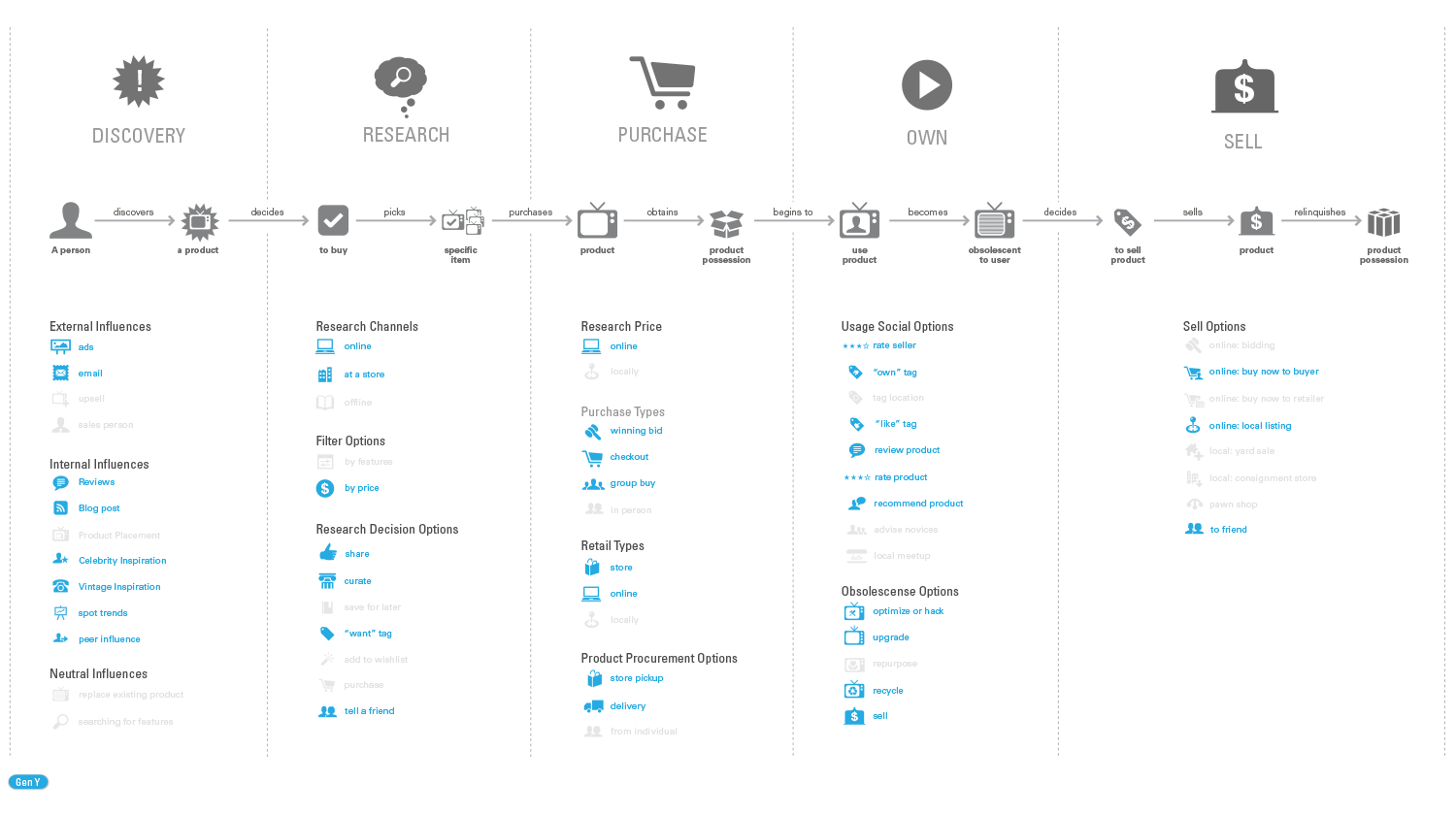
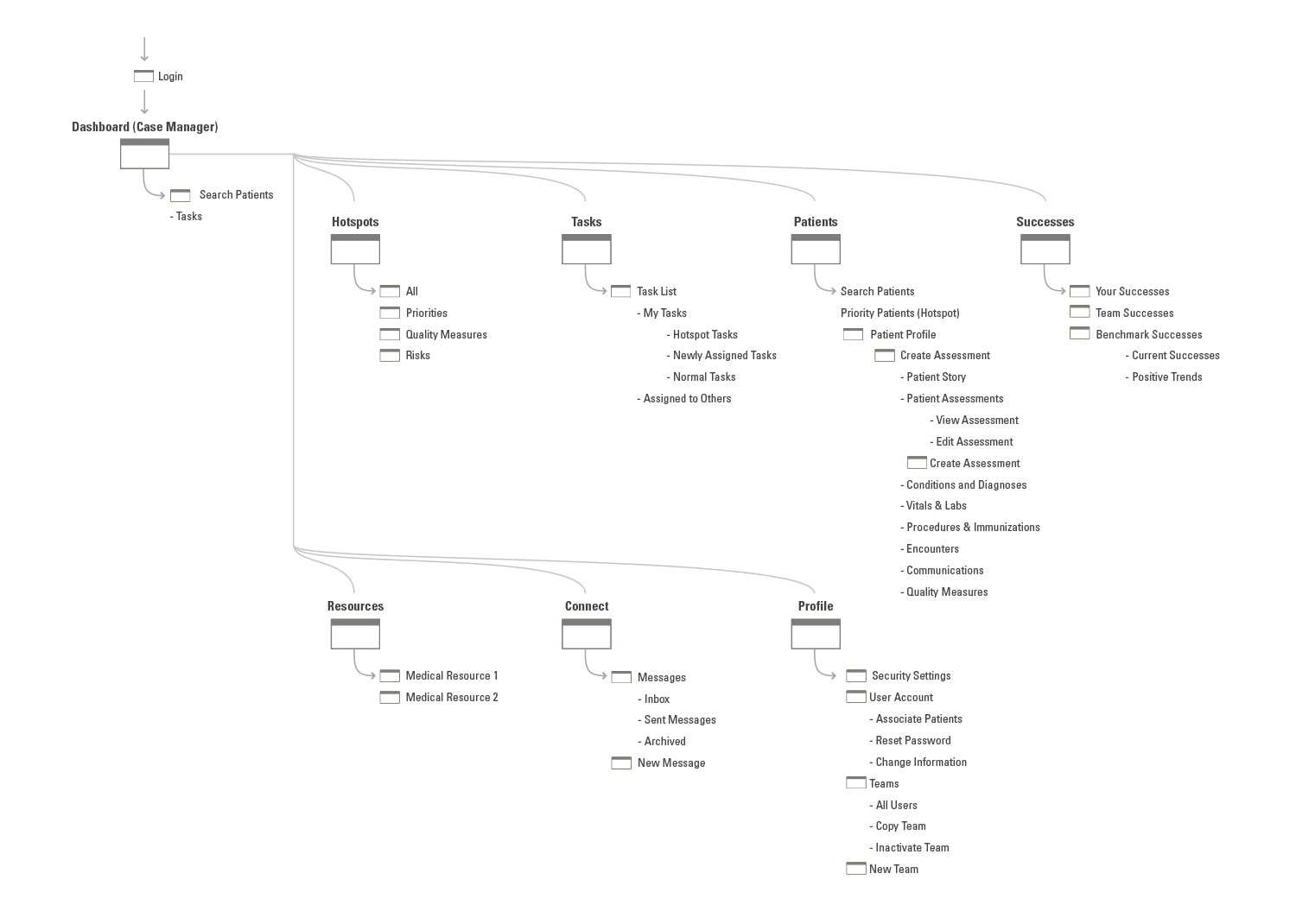
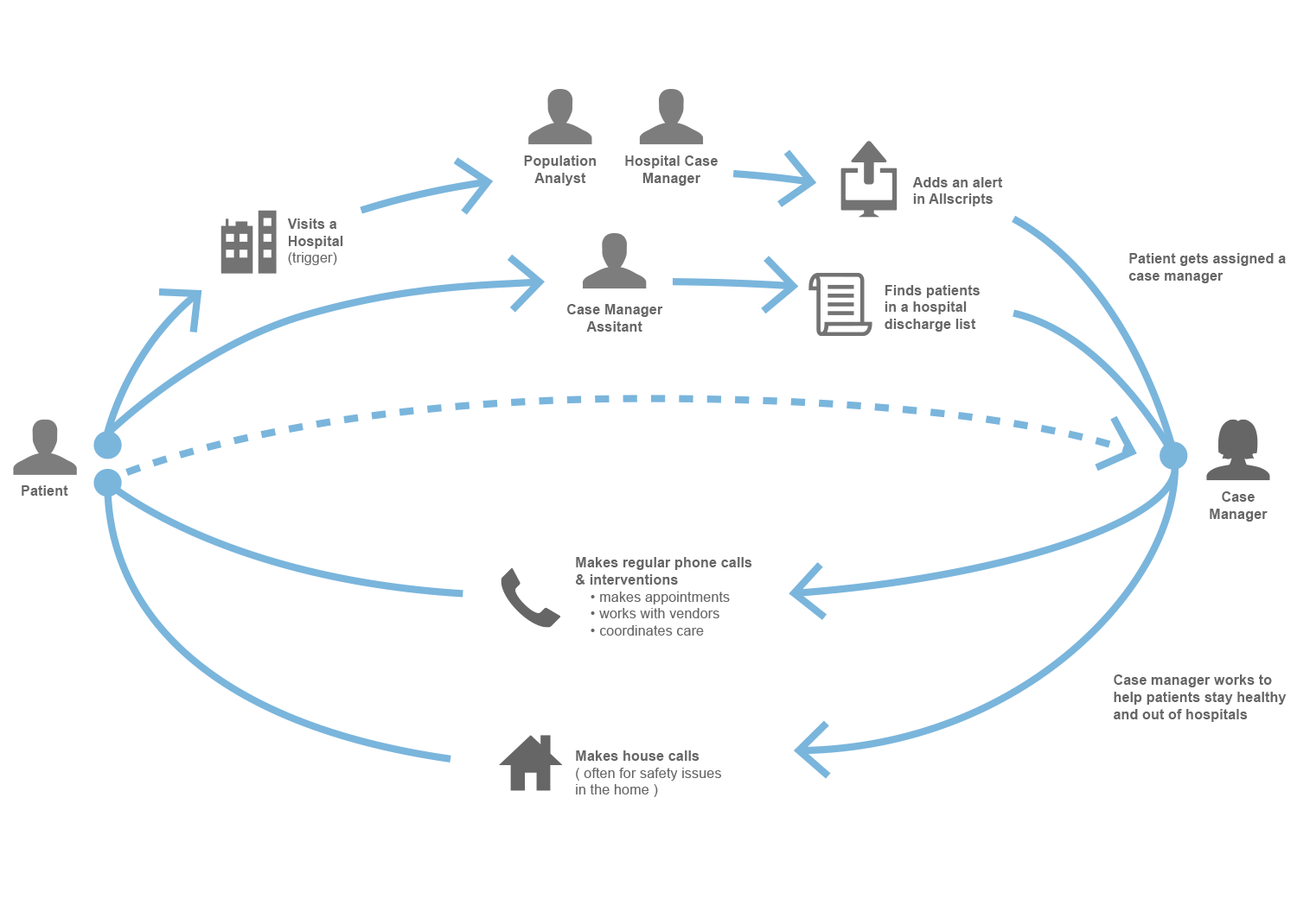
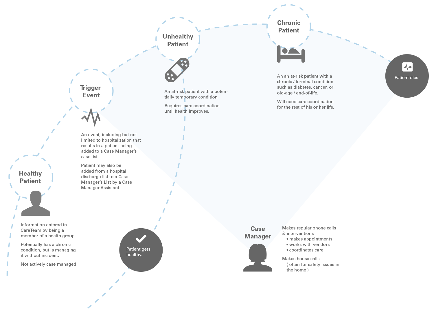
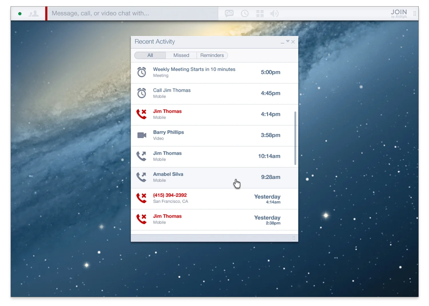
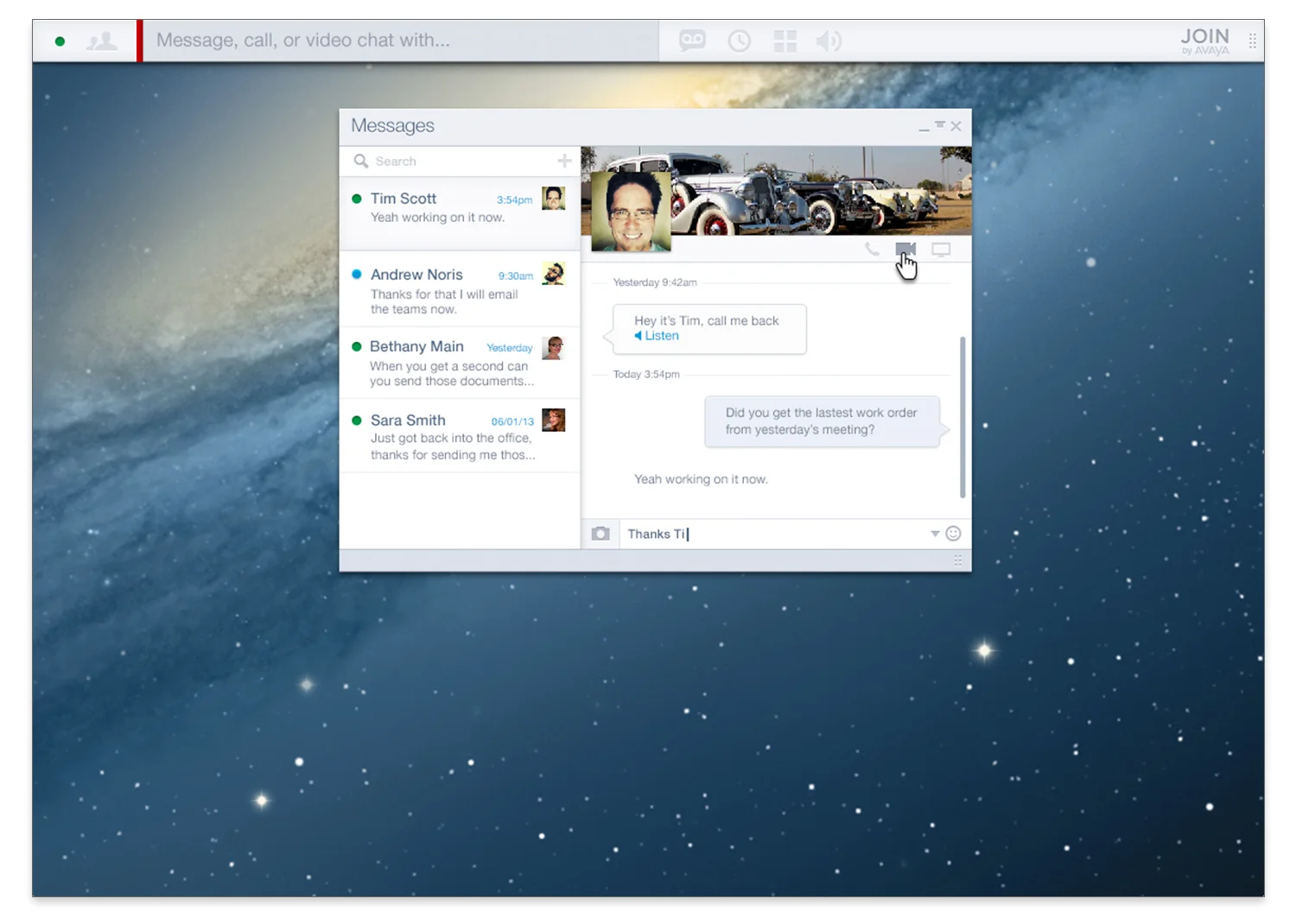
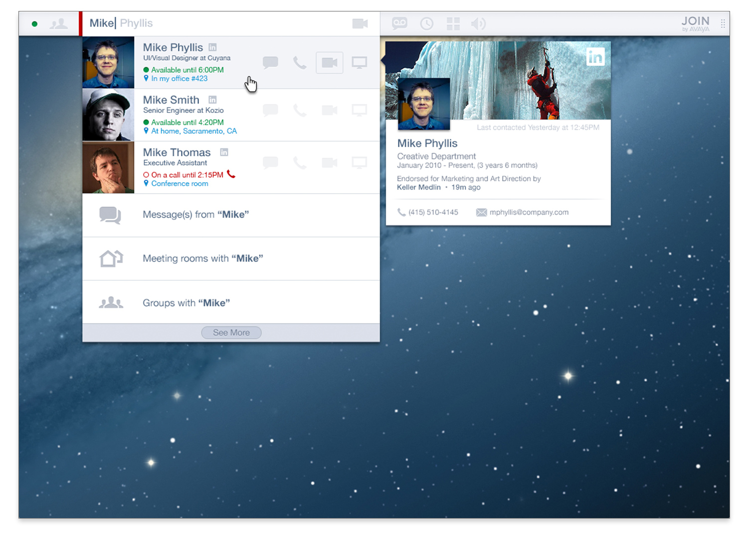
Find

Find takes a modern approach to shopping. A inifinite feed of products is generated by information inputed by the user on what they want, like or own already. Users are on trend, socially conscious, and almost exclusively Gen-Y. 

The application was based in Australia. If successful, it will be rolled out to the international community.

findsplash
 

Visual Design


autripleFTUE
2screensB
autriple1
2screens
triplescreen1c
2screensC
 

Concepts, Models, and Research


researchmobile1
 
researchmobile2


Avaya IPOCC

Background: Avaya IP Office Contact Center (IPOCC) enables resellers to offer a complete end-to-end Avaya IP Office solution to small and mid market companies who require multichannel contact centre functionality.

Avaya asked us to redesign their existing IPOCC application. A significant portion of the project was centered around updating the look and feel of the application and bringing it inline with the updated branding guidelines. However, we also made significant updates to the dated and cluttered UX/UI.

We followed a fairly standard user-centered design process, creating ad-hoc personas from interviews with key stakeholders, developing specific flows for each persona, and finally generating UI synthesized from our research. 


Visual Design


IPlogin
 
ipdash
 
ipgroup
 
iptele1
 
iptele2
 
iptele3
 
ipsuper1
 
ipsuper2
 
ipemail
 
ipchat


Personas


ippersona1
 
ippersona2


User Flow


ipflow


Early Concepts


ipearlyconcepts1
 
ipearlyconcepts1
 
ipearlyconcepts3


Care Management

Aetna, a member of the Fortune 100, challenged us with rethinking how to optimize "In-home” care by better supporting the individual Care Managers and care manager networks that provide it. They had several disparate applications that Care Managers utilized, however research showed that more time was spent filling out paperwork, ramping up on new software updates and dealing with internal bureaucracy than actually providing patient care.

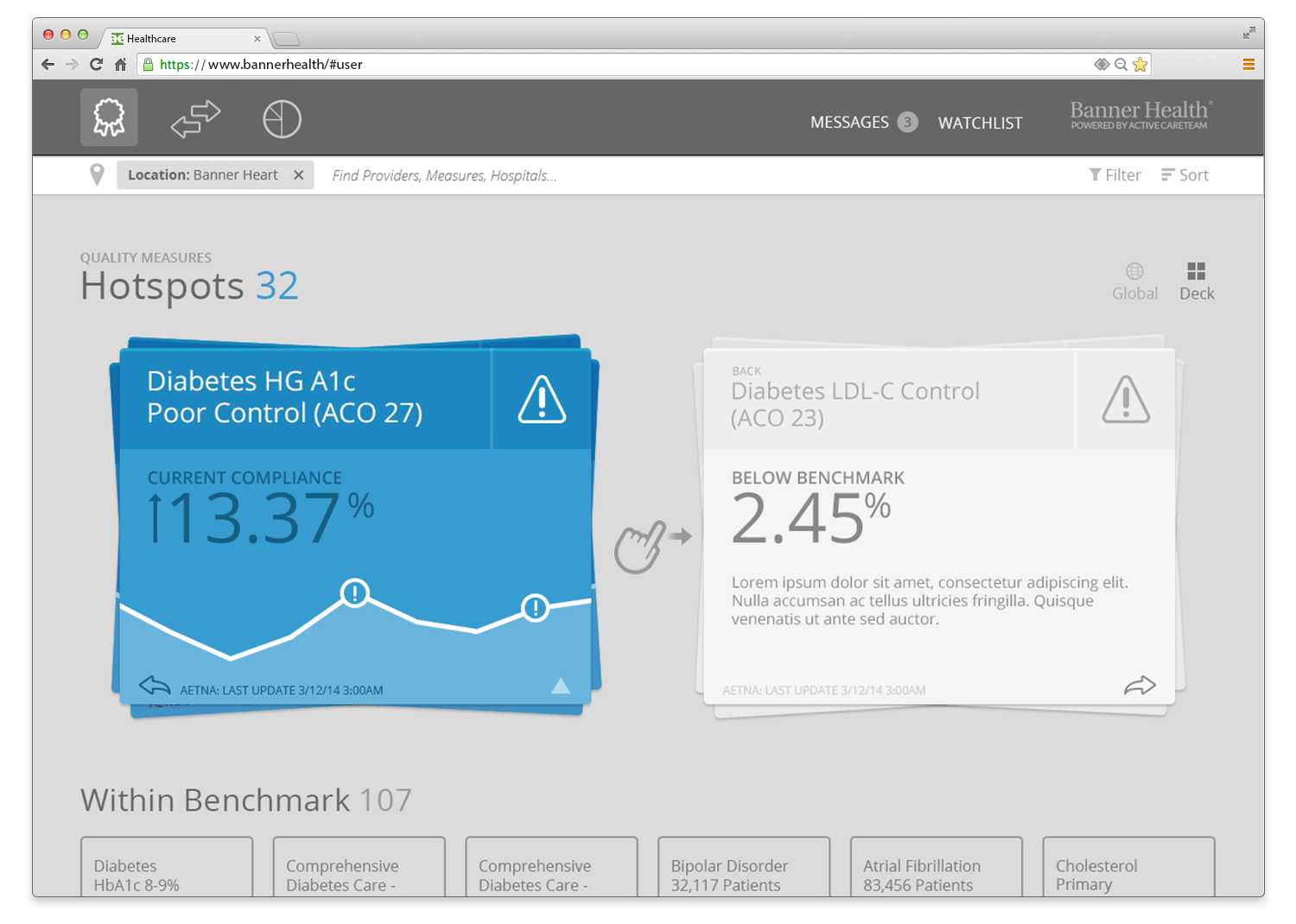
An initial brief with internal research was provided as well as pre-recorded interviews with Care Managers. We were also put into contact with several experienced Care Managers that we could bounce ideas off and make sure our models, assumptions and details were accurate. Beyond that we were given a green light to think big and come up with a new model of how Care Managers could deliver better care. Many concepts were iterated on, modeled and sketched out, but one stood out among the rest and mirrored the clients sentiments. That concept was later coined as “Hot Spots”. 

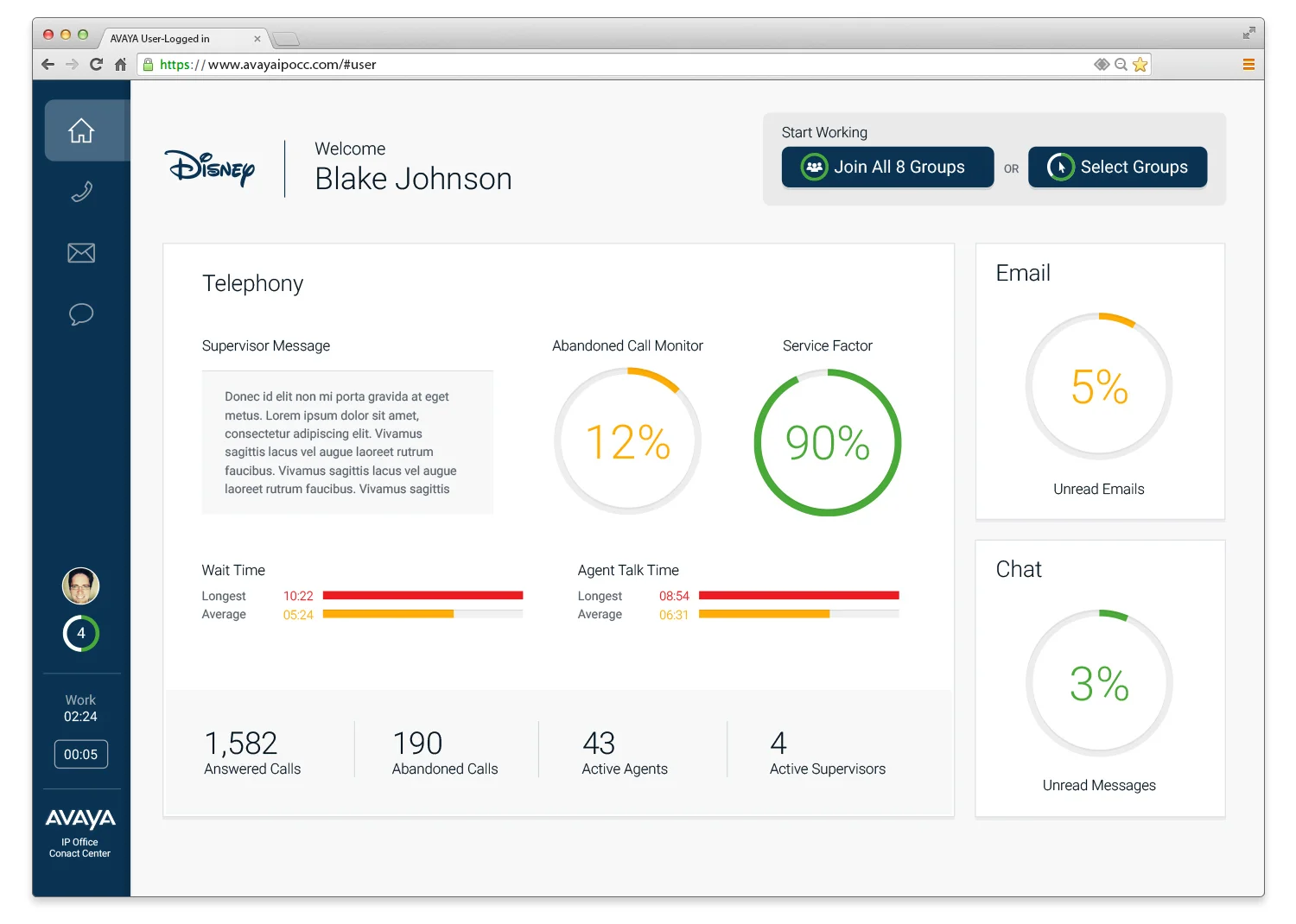
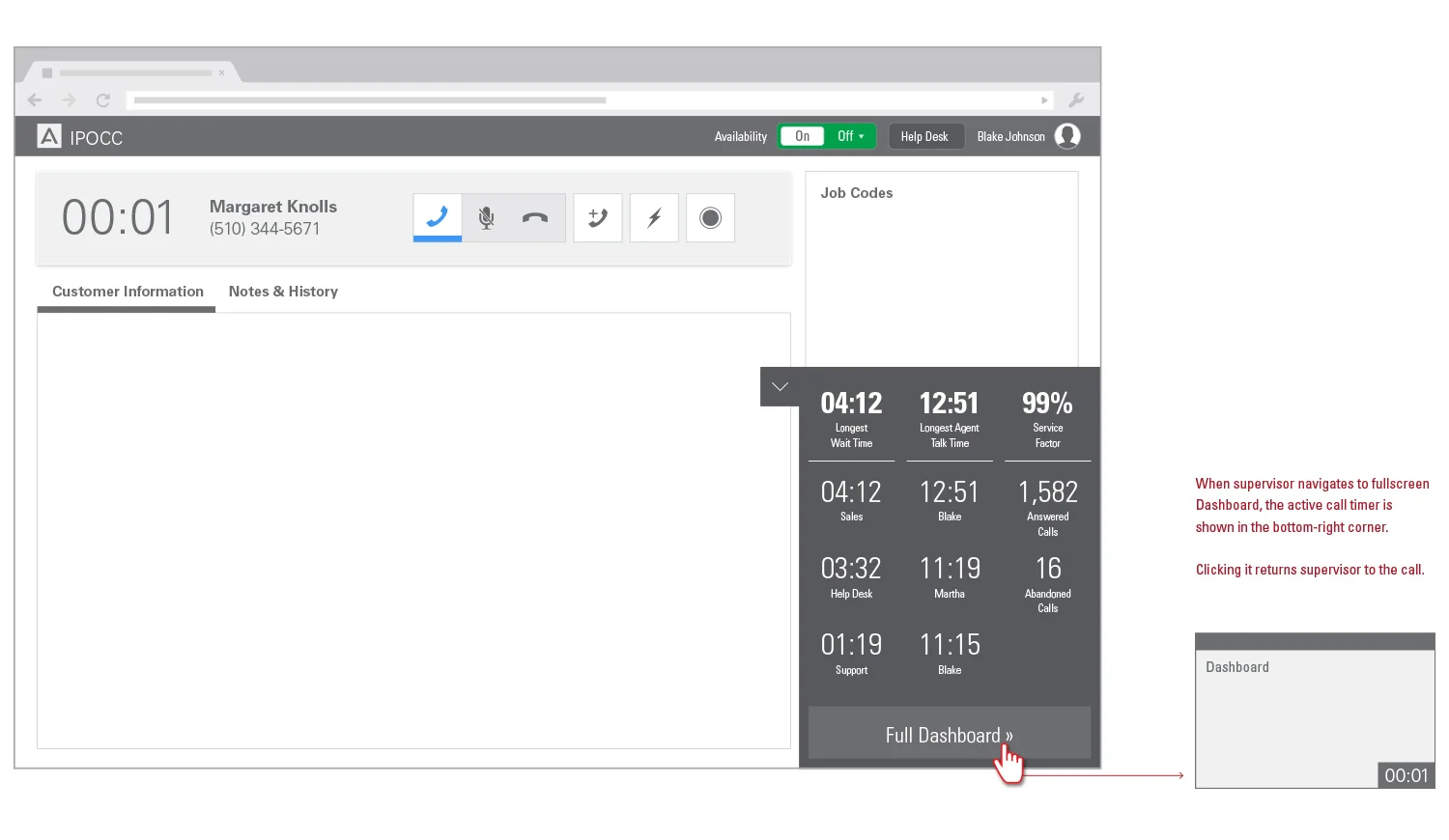
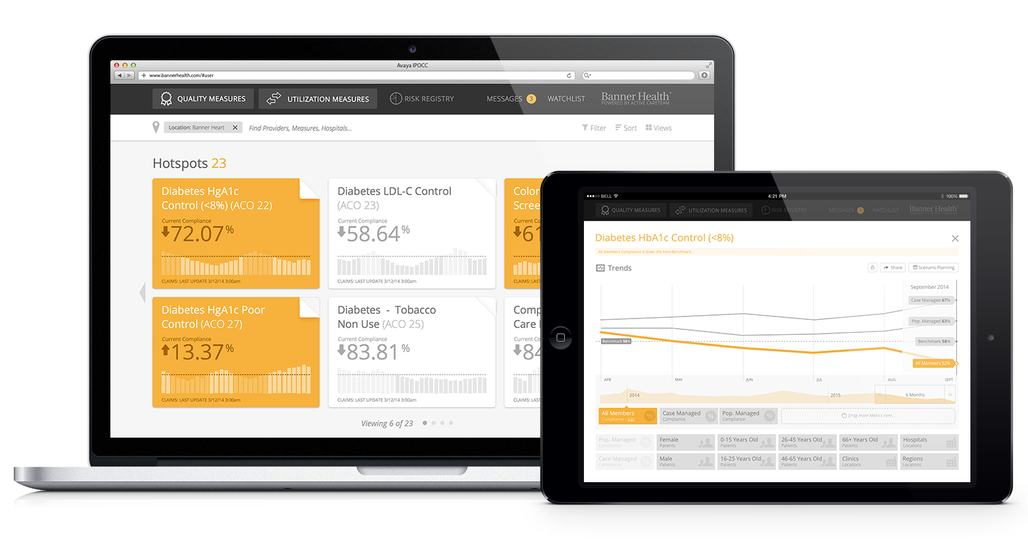
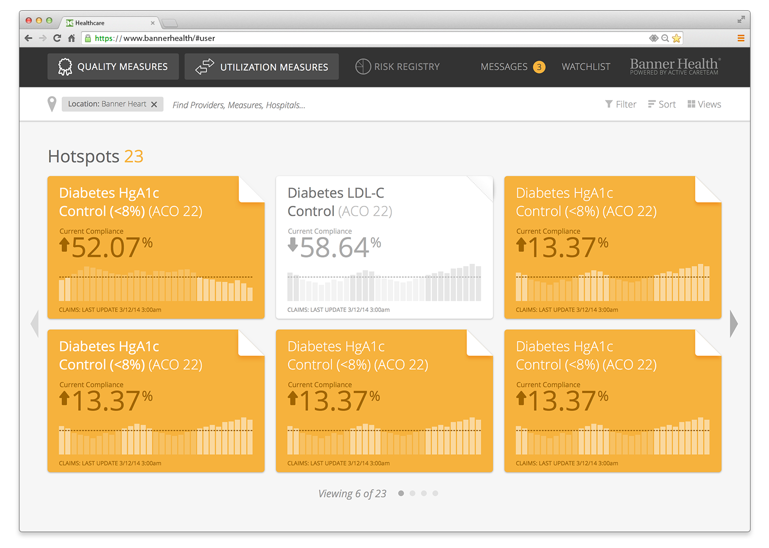
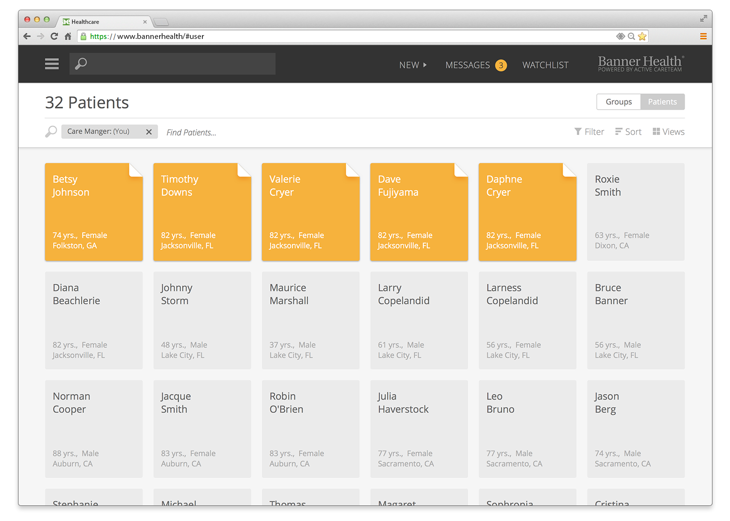
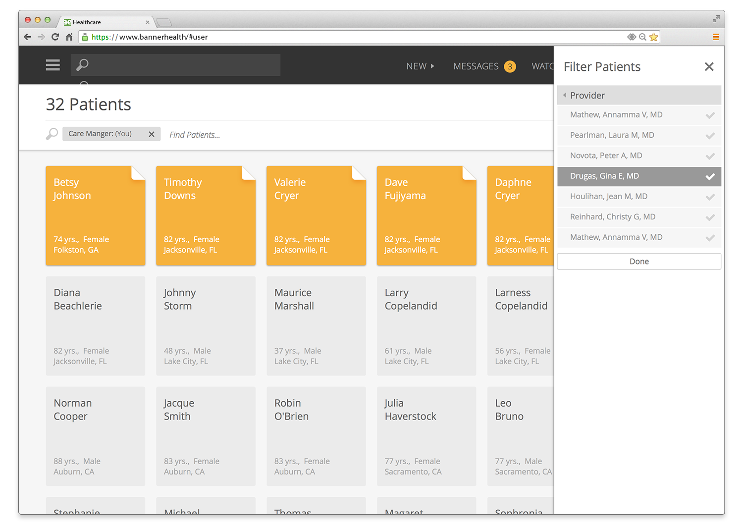
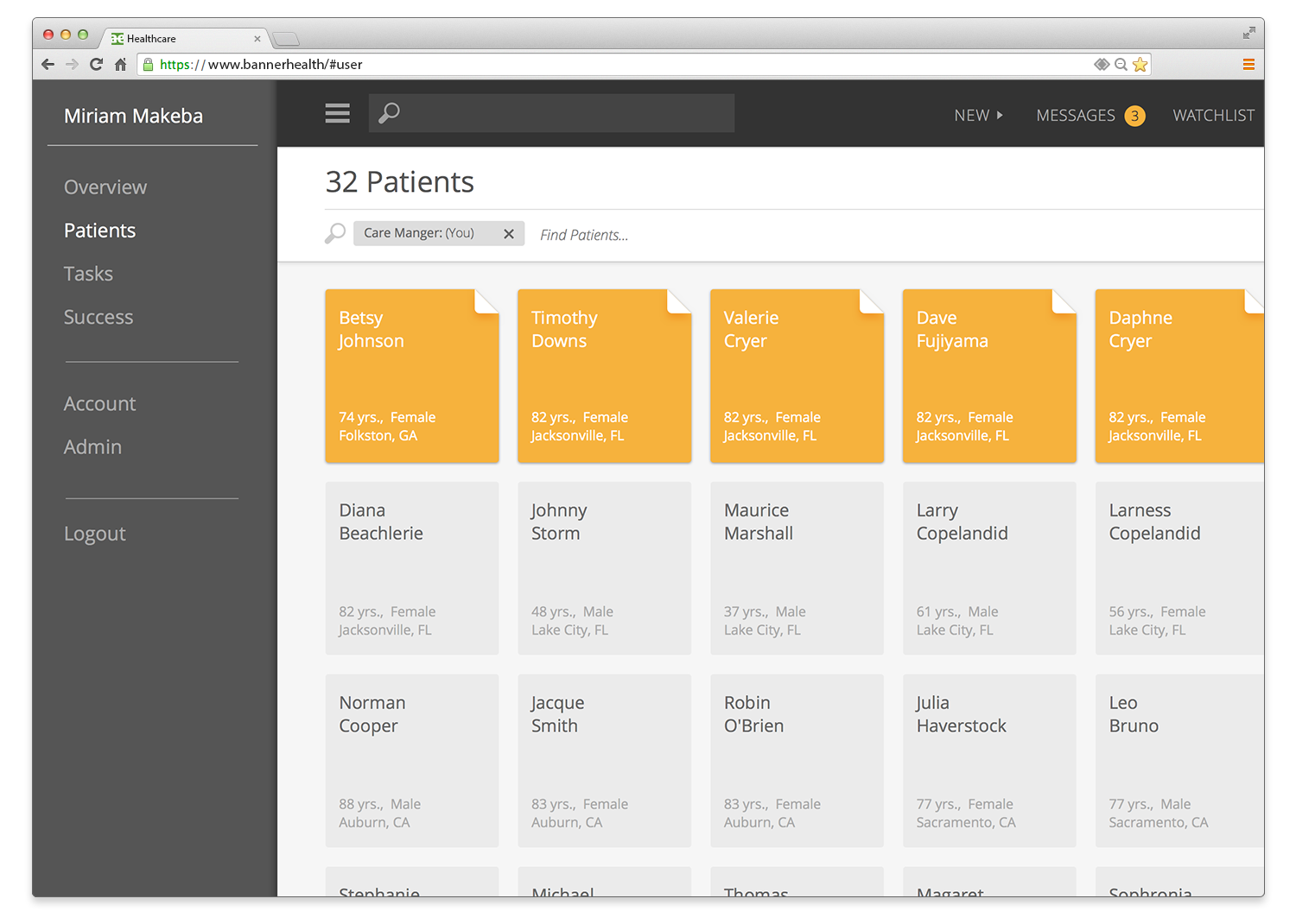
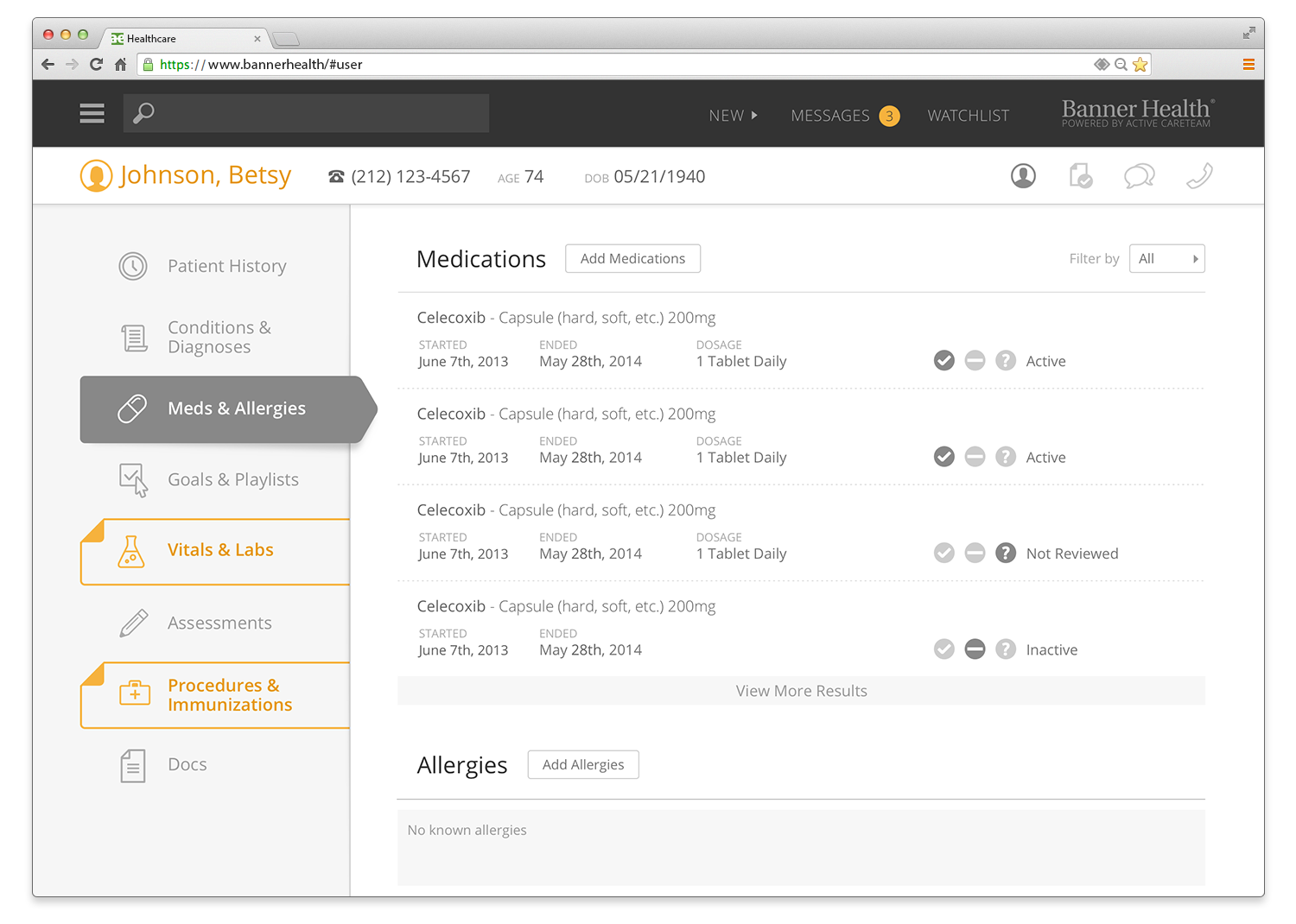
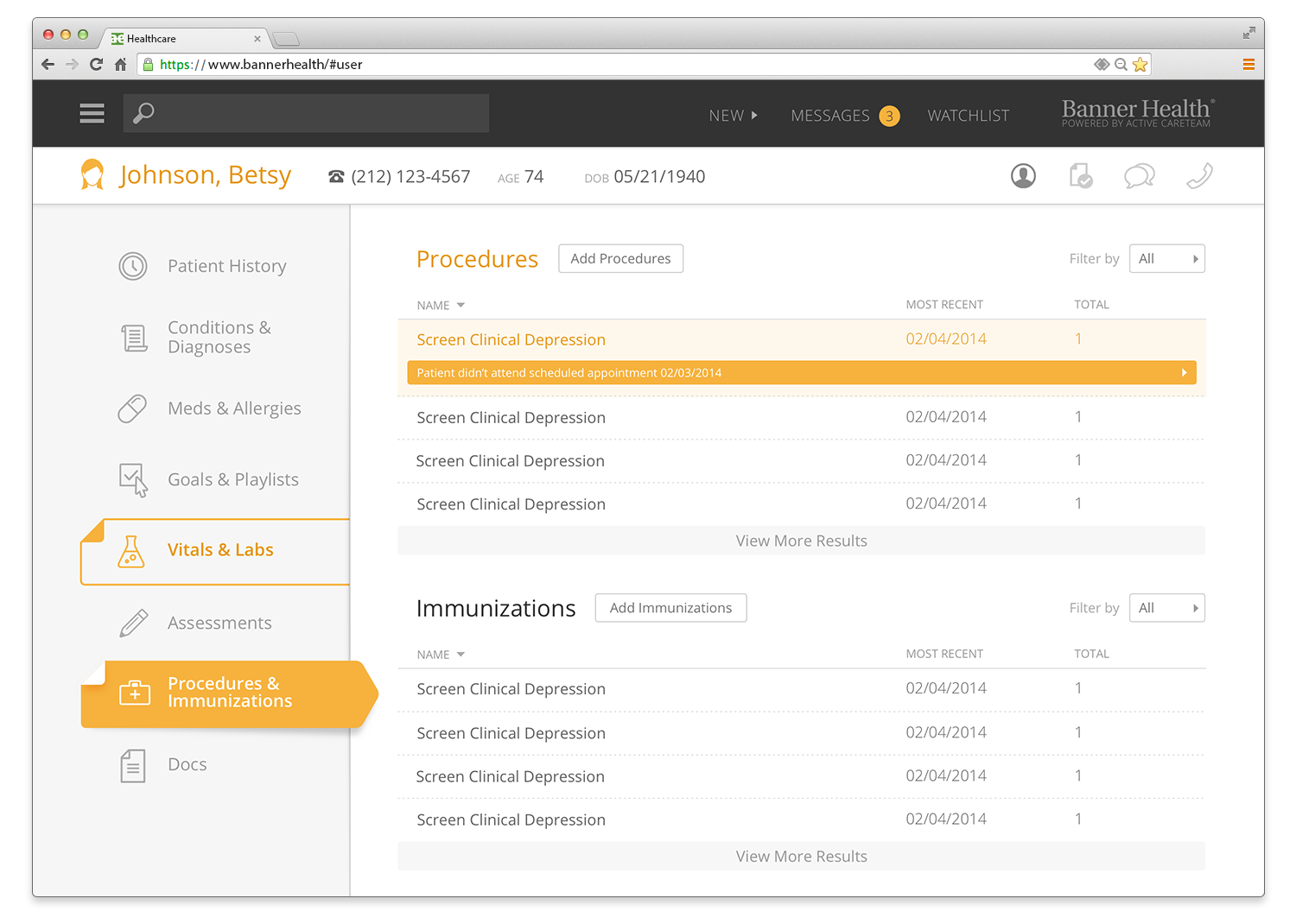
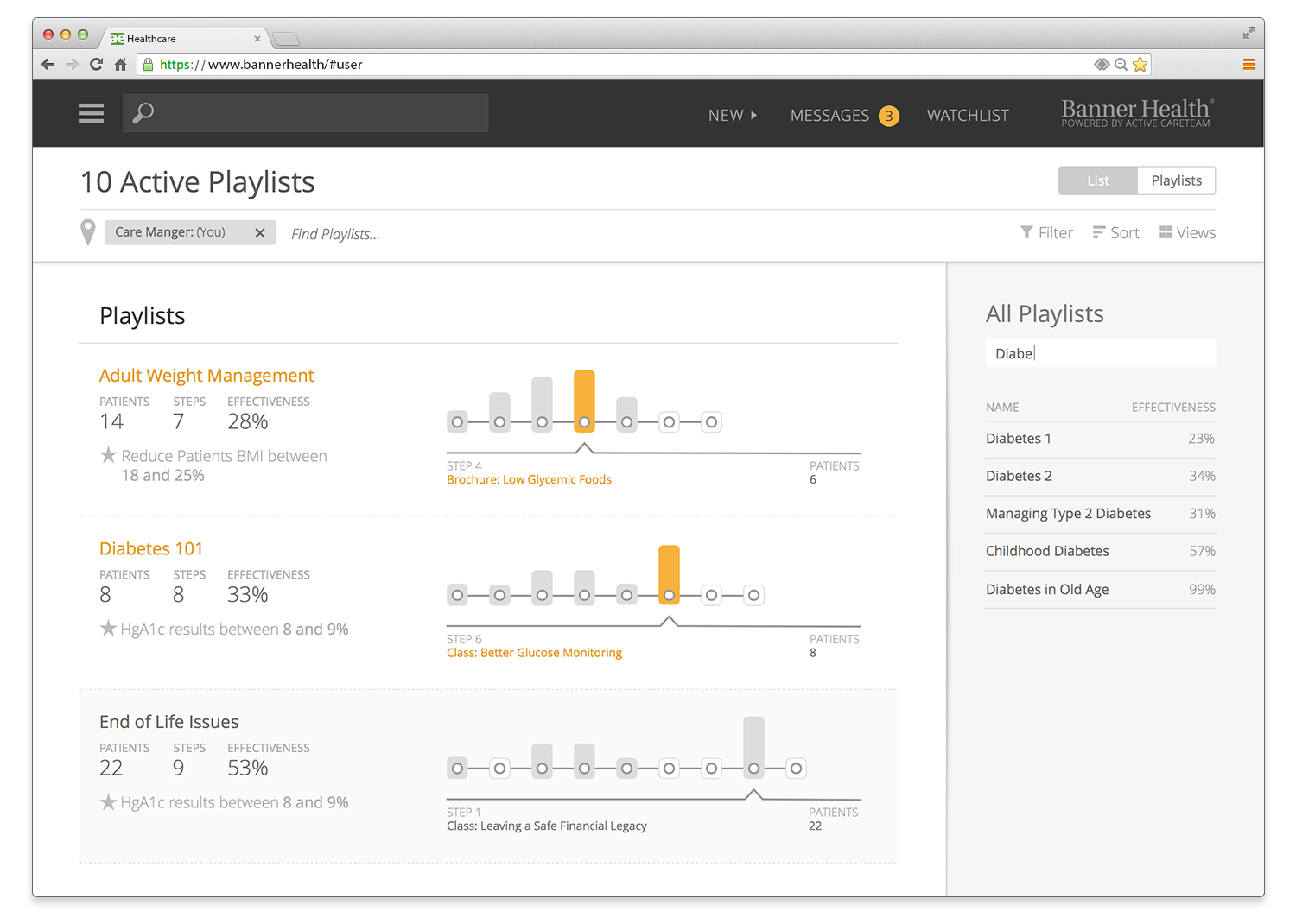
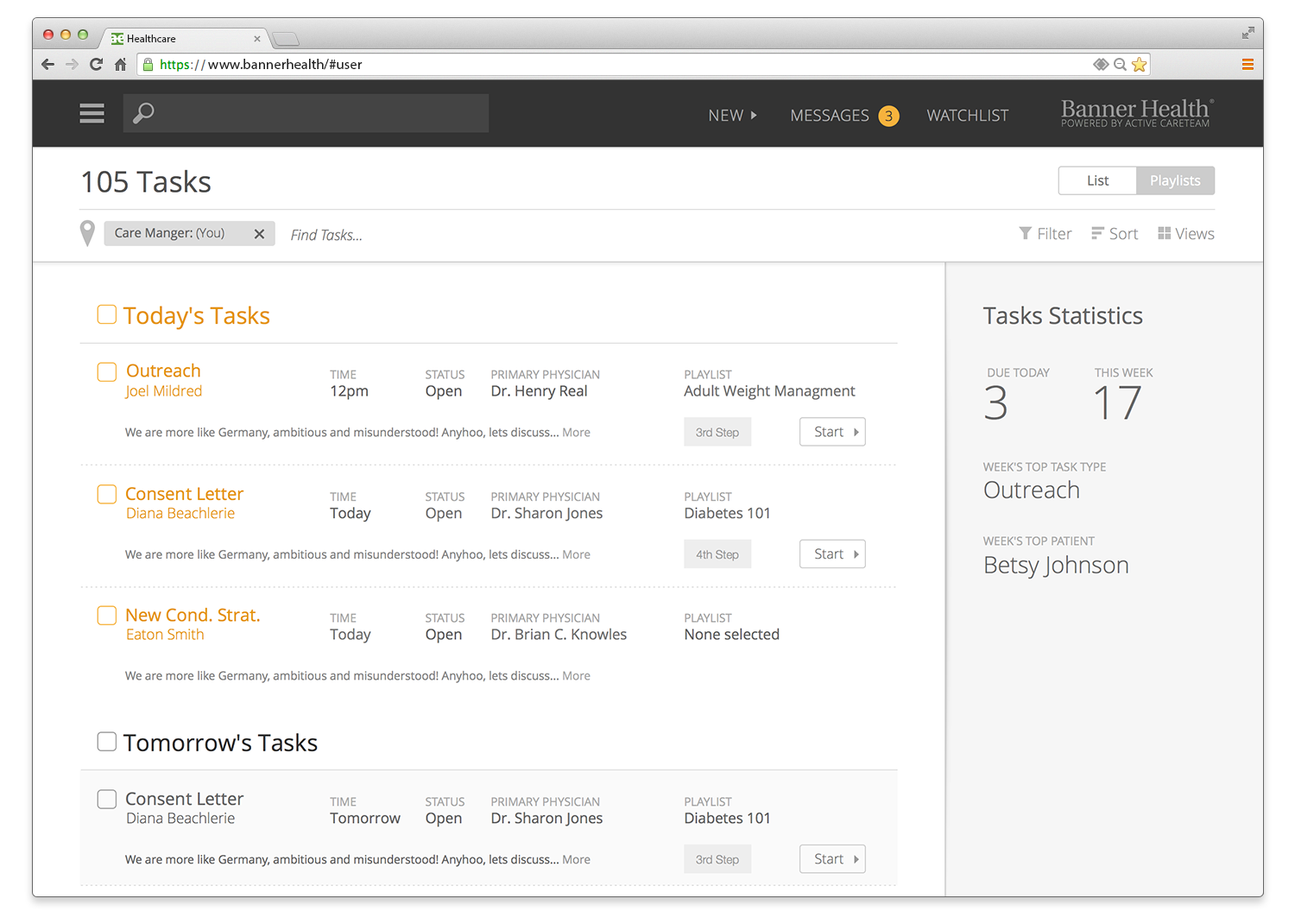
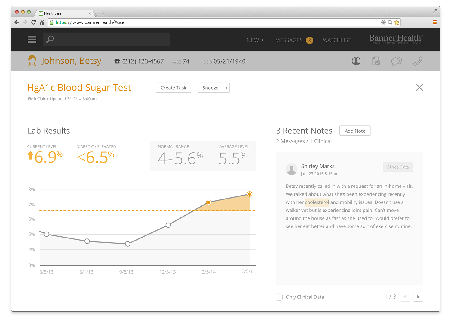
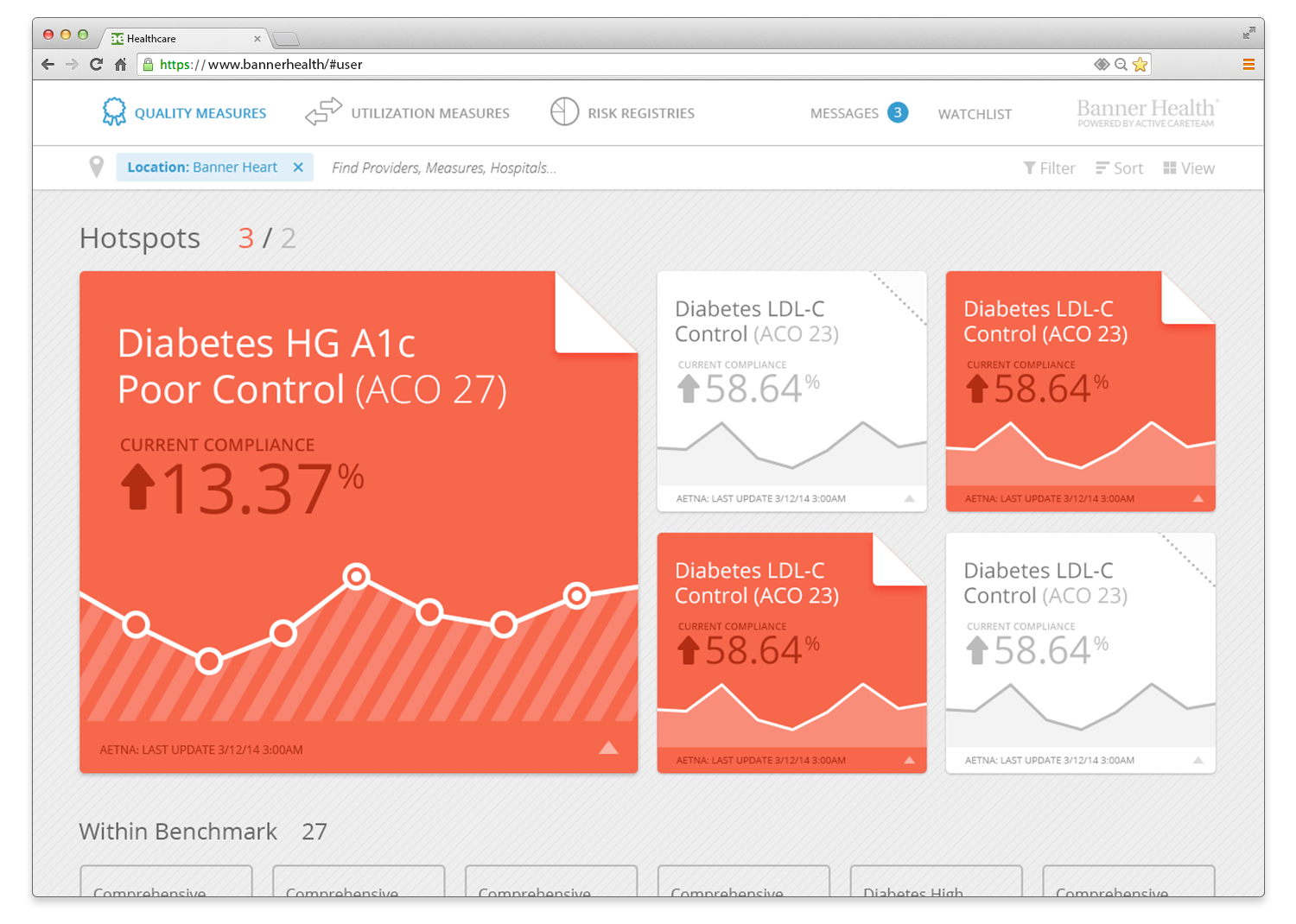
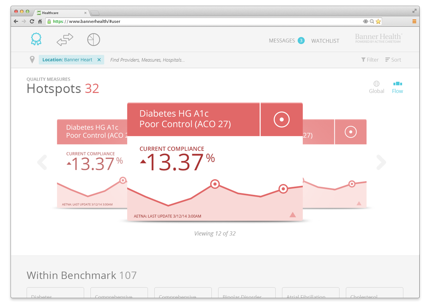
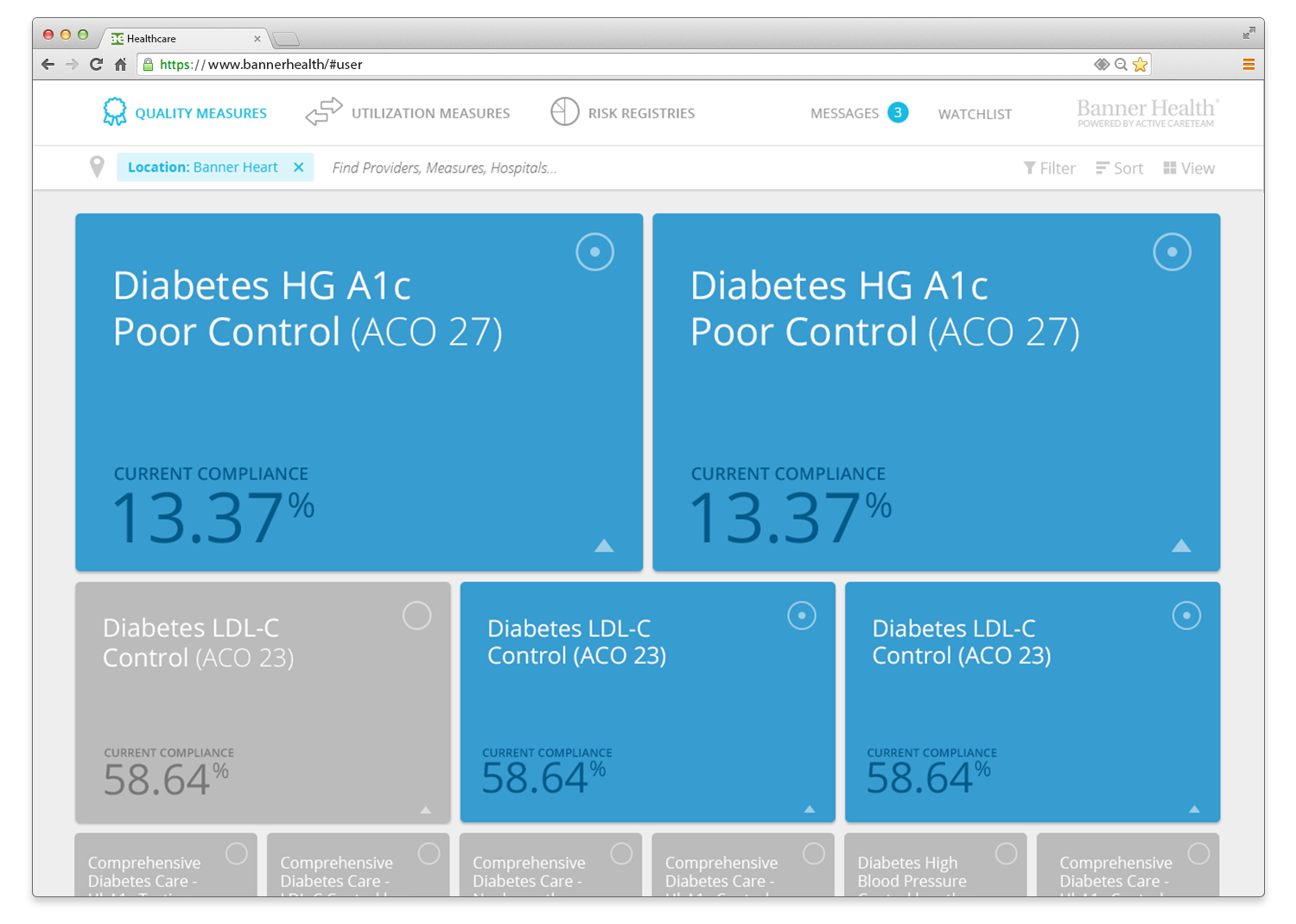
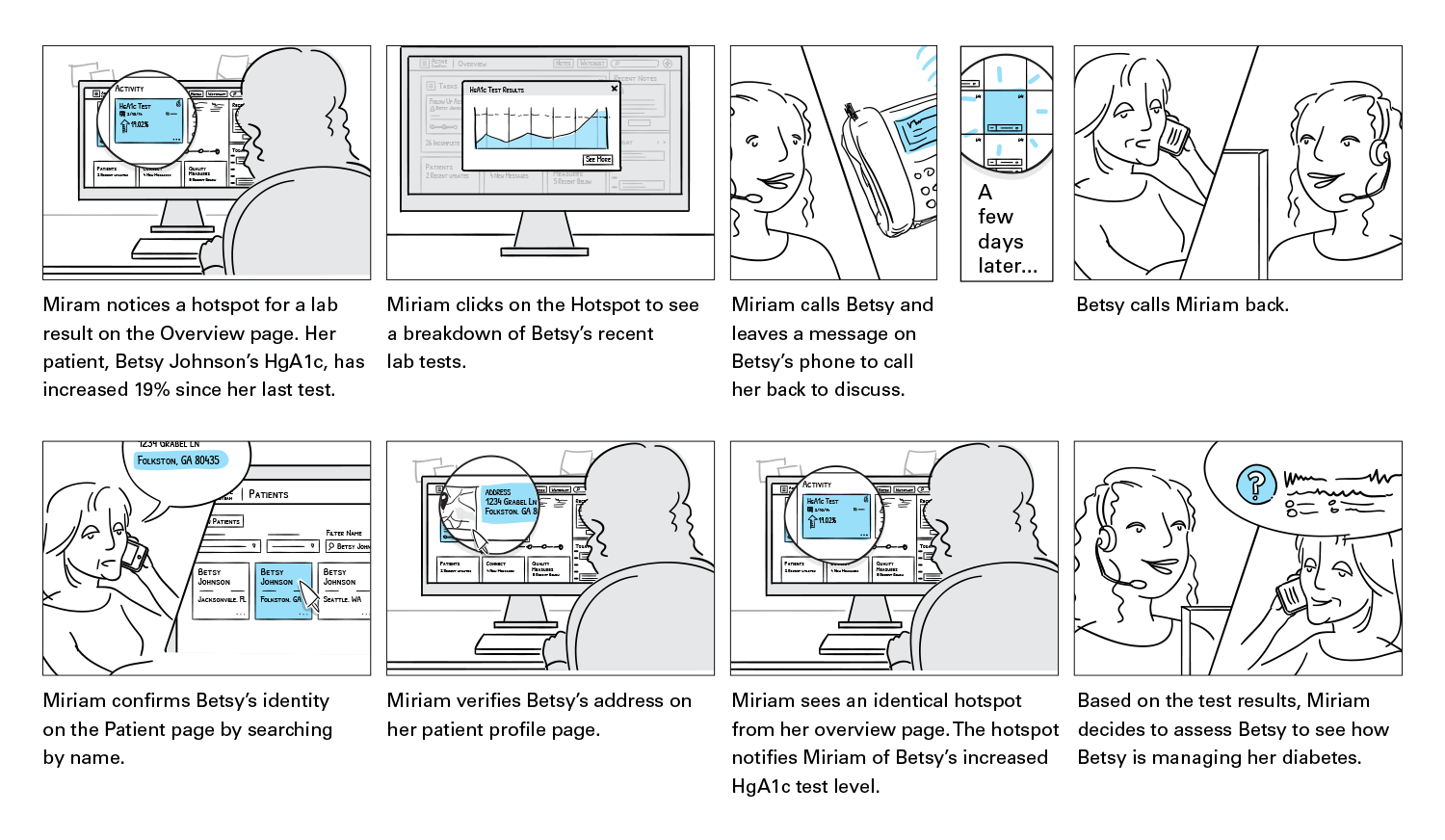
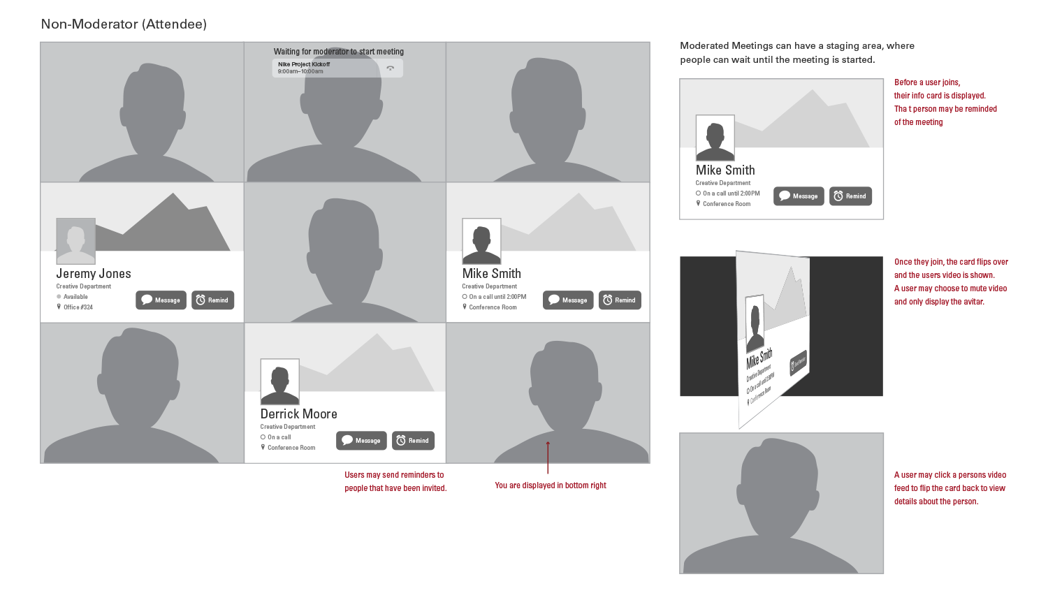
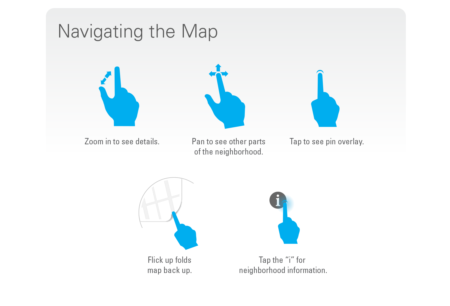
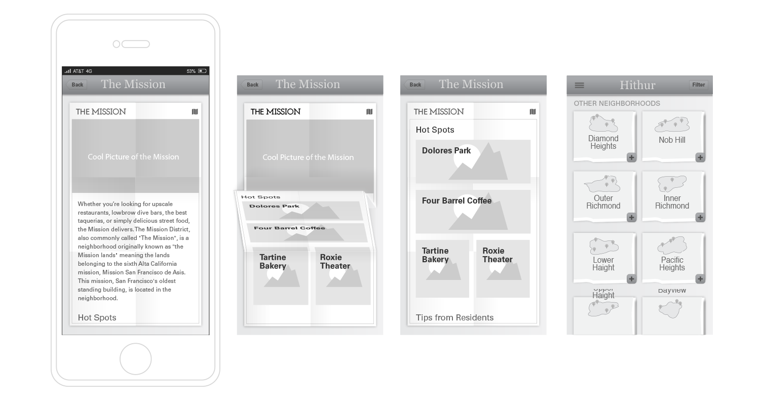
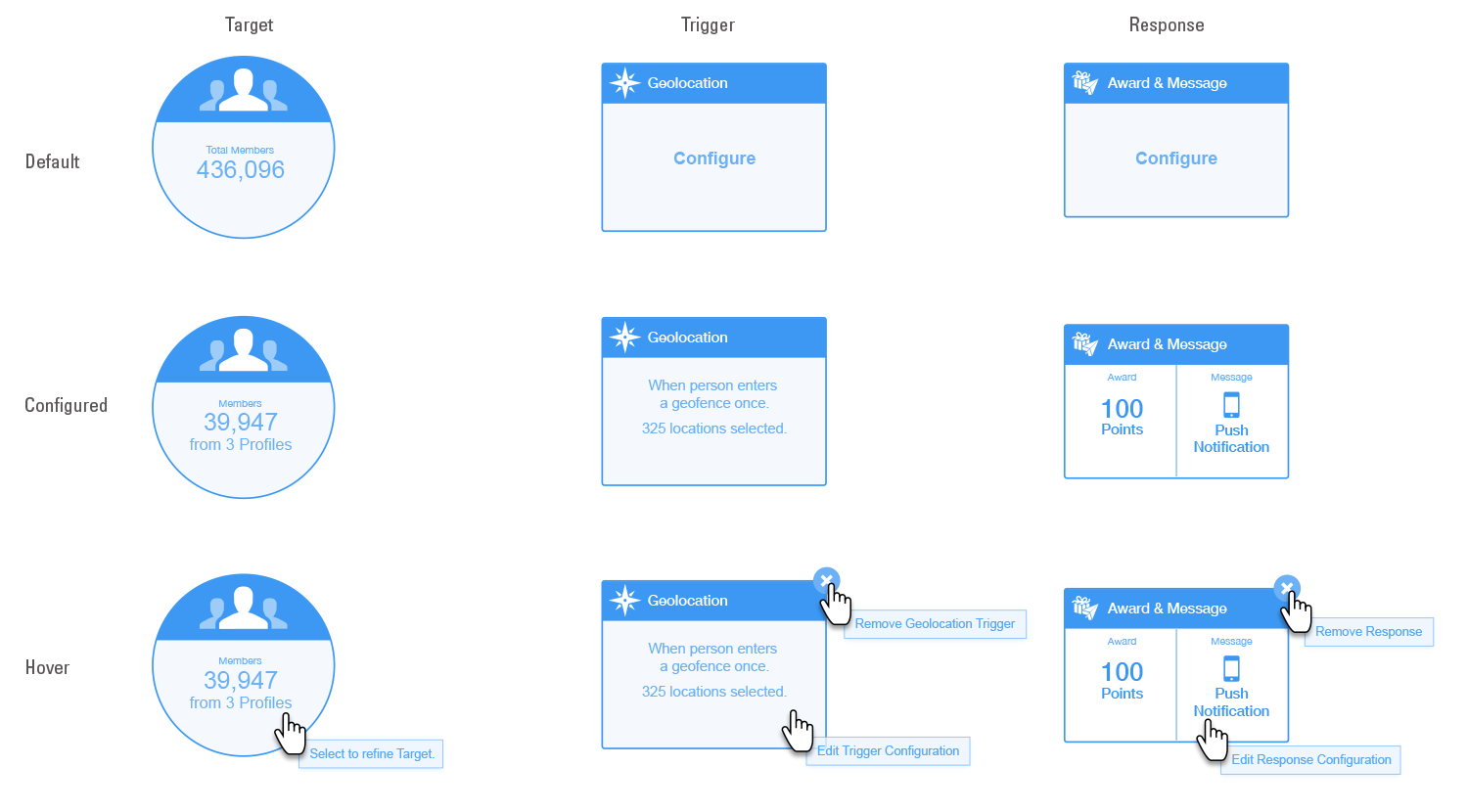
Hotspots are visual cues to guide the user’s attention to the most relevant pieces of information. They clearly show what are the most important aspects of a page. This metaphor guides the users without undermining their independence. This allows the Care Managers to easily navigate amongst which patients need the most attention and what items need to be addressed immediately. Items of lower importance are greyed out and are meant to visually recede into the background.

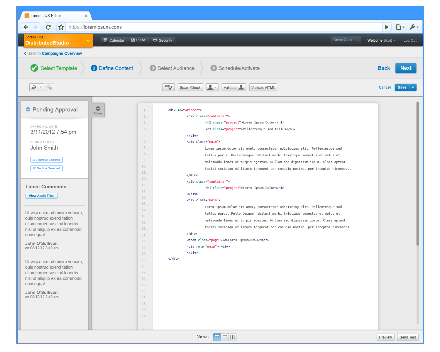
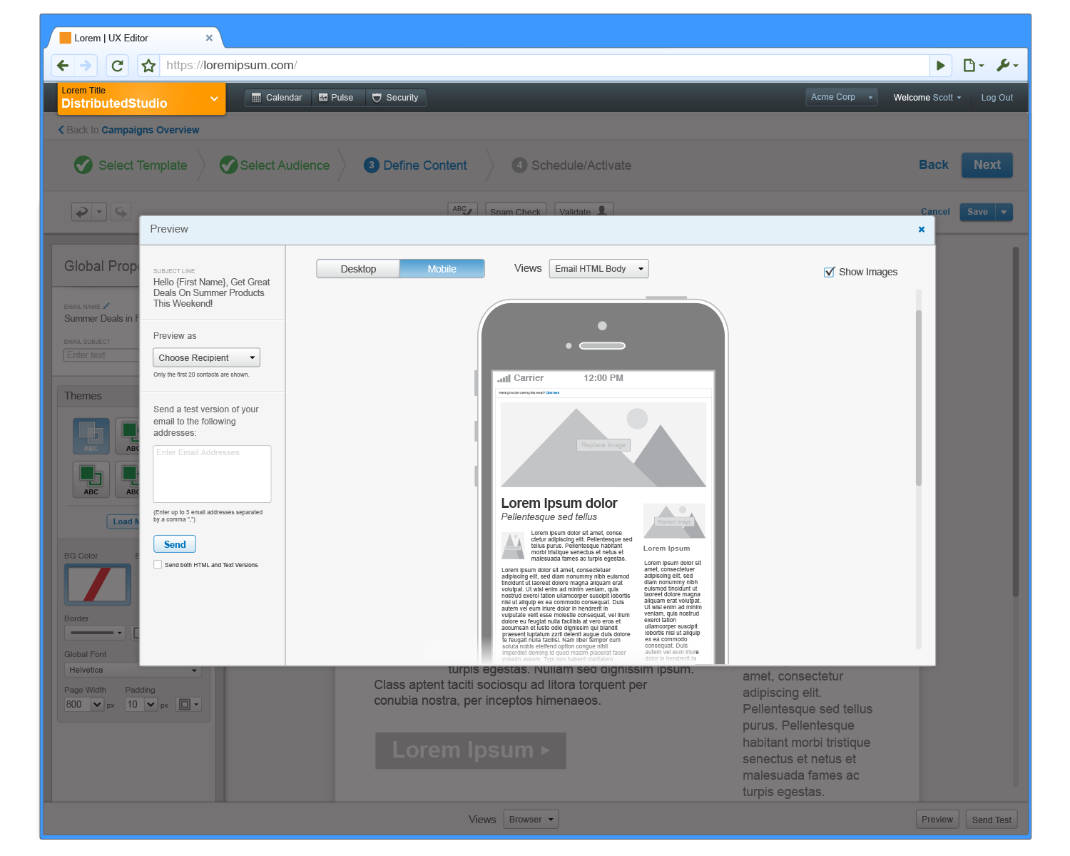
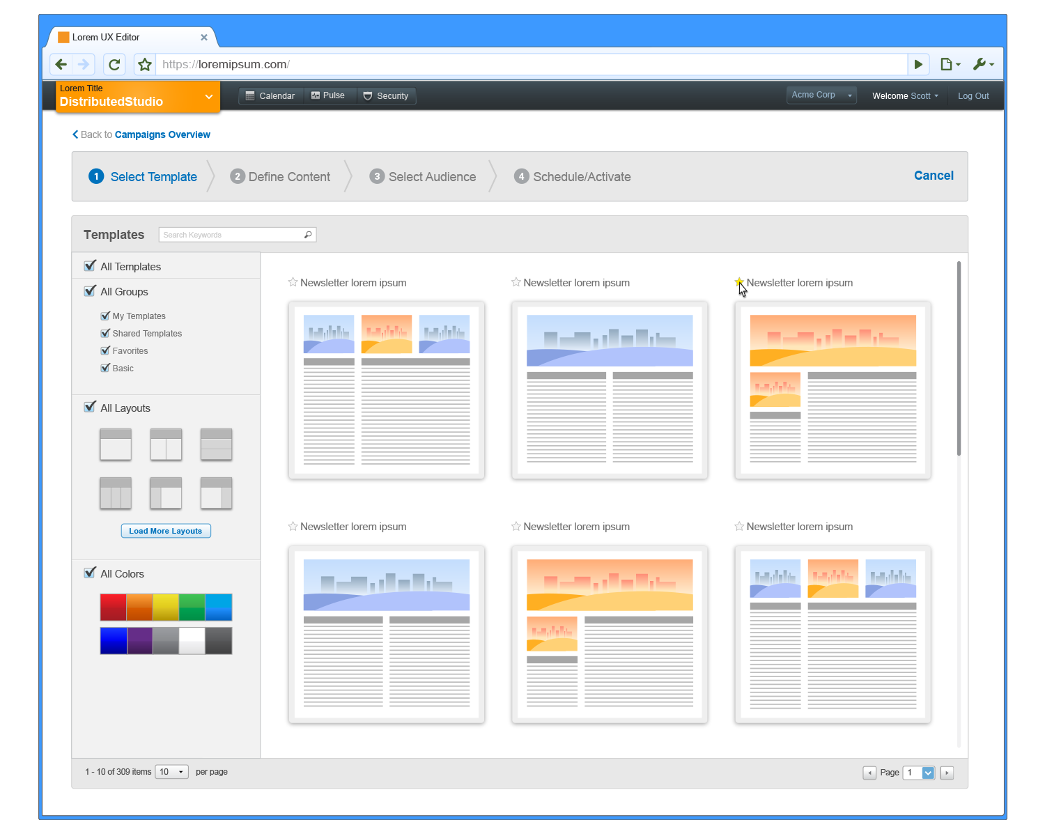
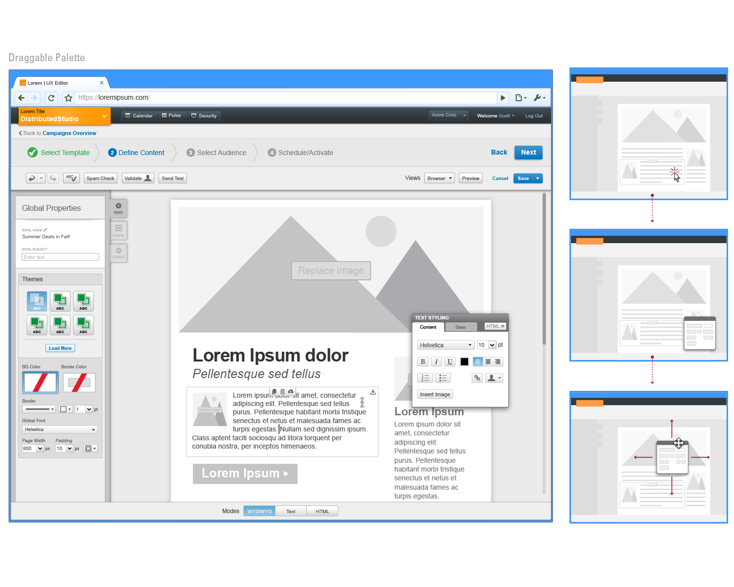
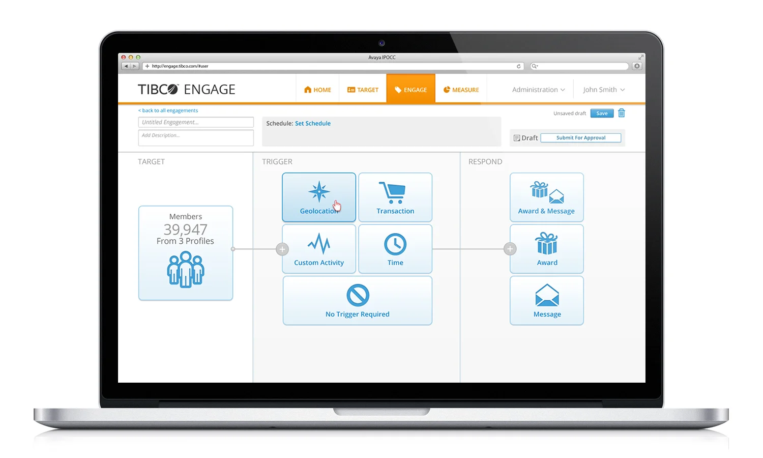
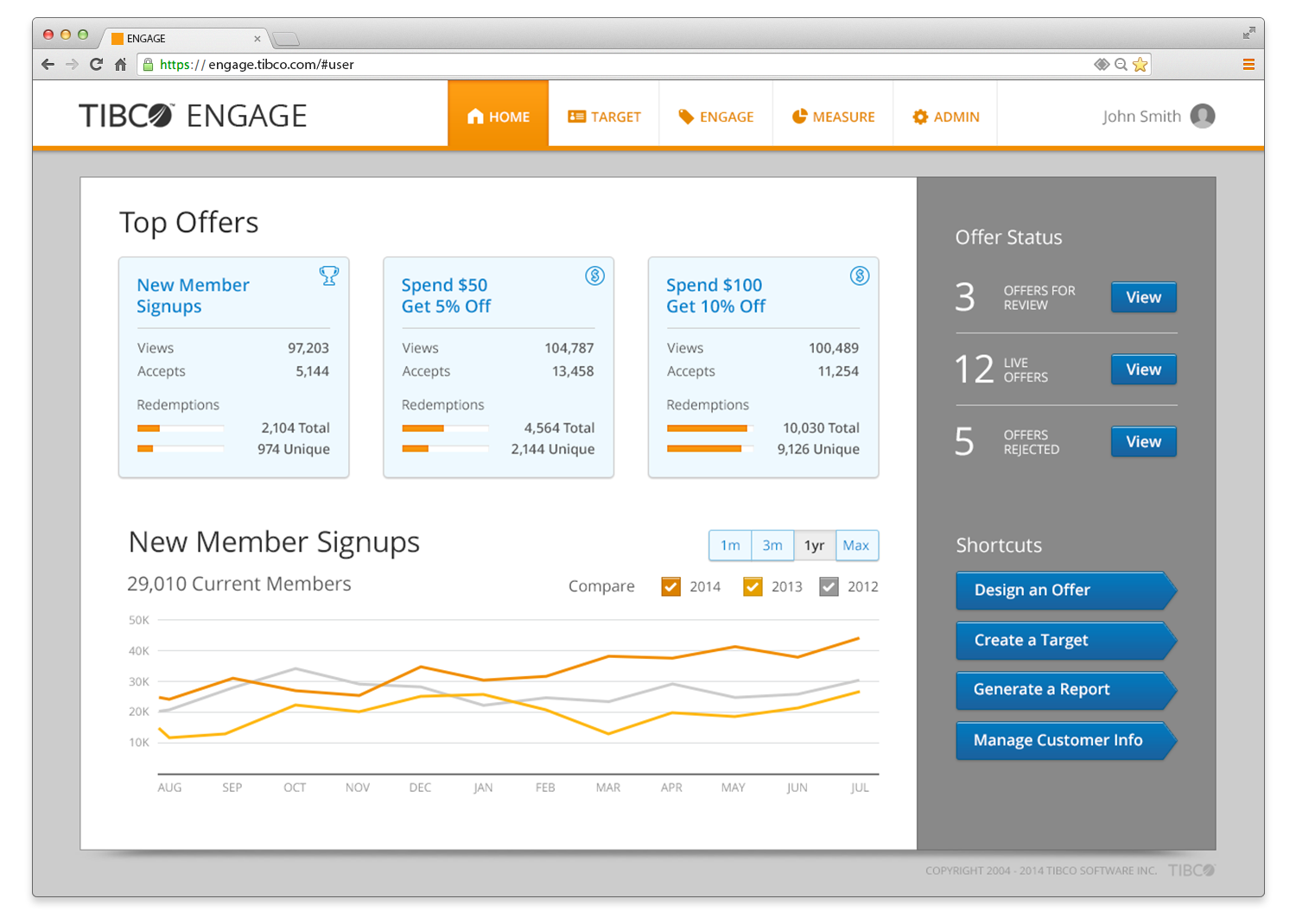
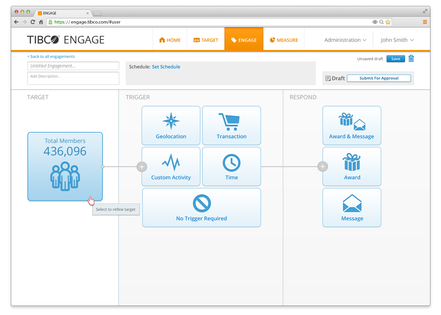
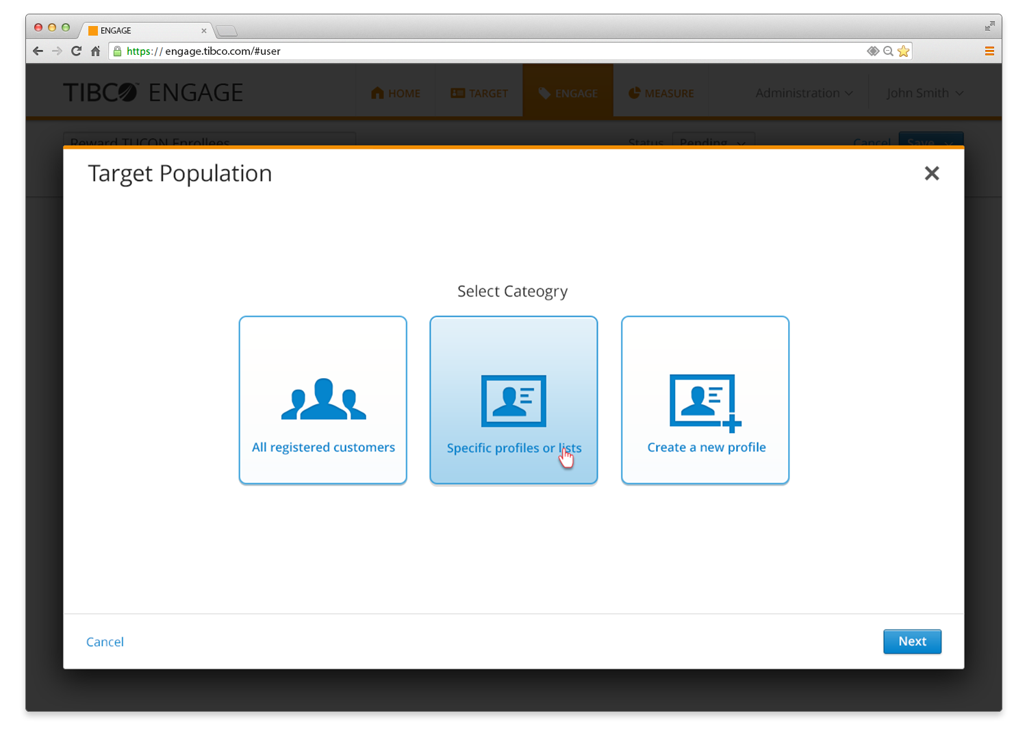
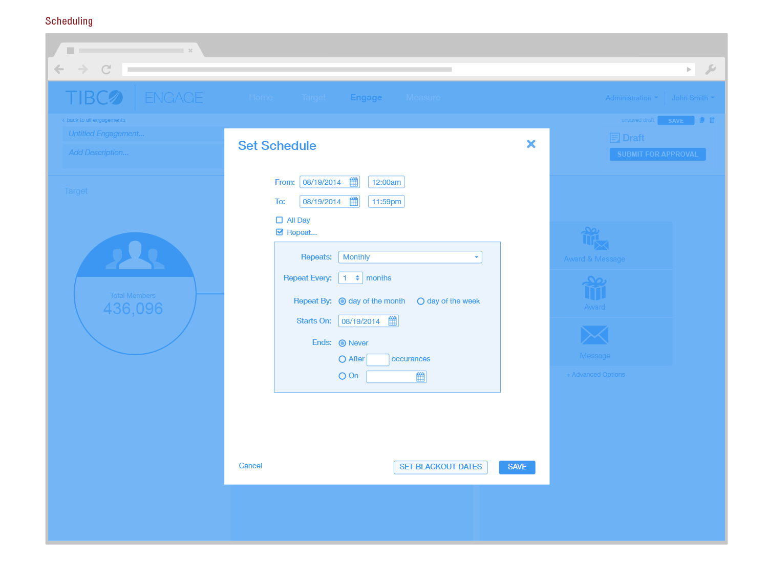
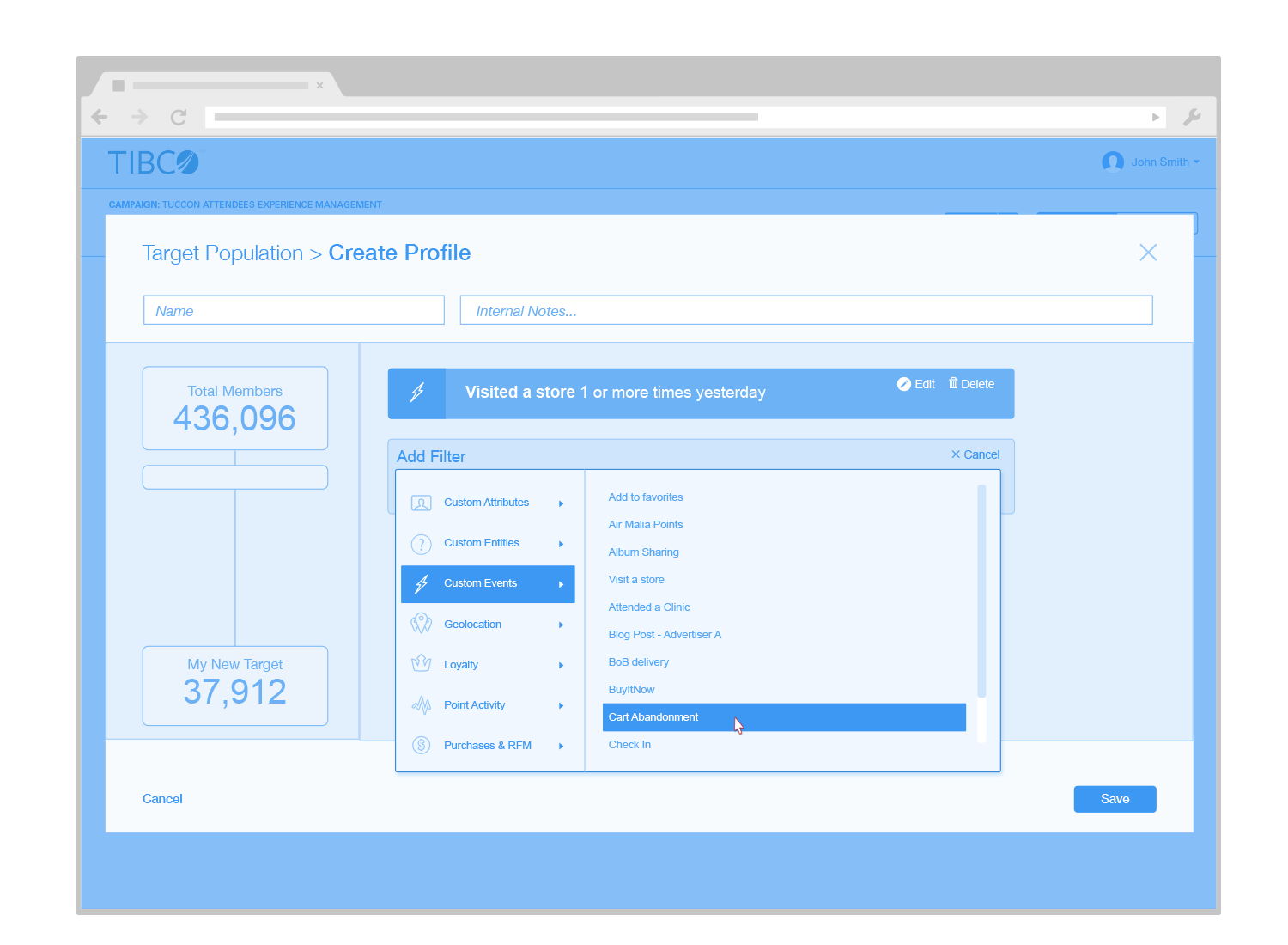
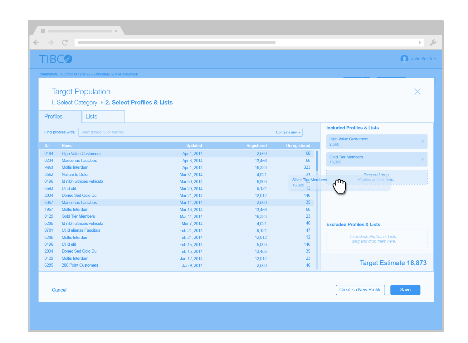
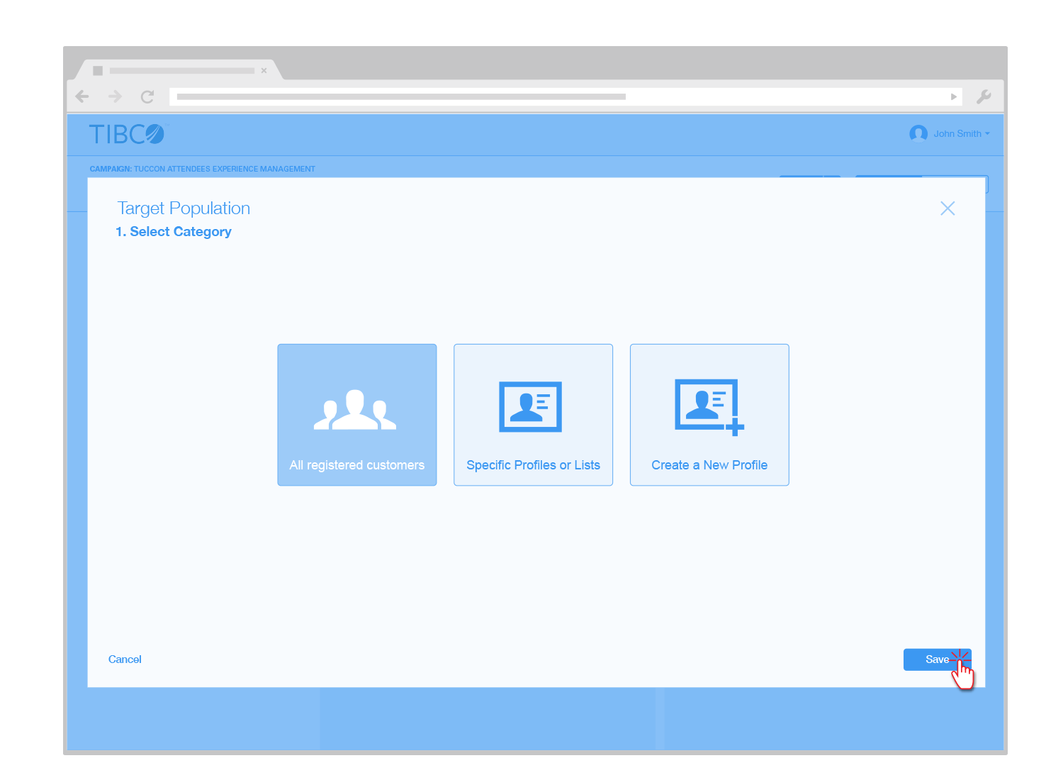
Below you will find this metaphor blended evenly into the entire application.

 
healthheader
 

Visual Design


dash
 
allpatients
 
allpatients2
 
allpatients3
 
patients1
 
proc
 
tasks1
 
tasks2
 
vitals


Additional Visual Design Concepts


altviz1
 
altviz2
 
altviz3
 
altviz4


Concepts, Models, and Research


healthai
 
caremanagermodel
 
caremodel
 
storyboard


UNIFIED COMMUNICATIONS

An internal team at Avaya asked us to think big and come up with a "Vision" piece for unified communications within an enterprise company. Their existing product "Avaya Communicator" currently provides text and video chat. However, with recent developments in Web RTC, they wanted to create a more integrated application that would allow users to communicate across all channels; email, chat, video, phone, etc.

We researched many existing consumer products like Google Hangout and Room.co and crossed referenced that with enterprise conferencing solutions like Webex. Wireframes, visual design, and a click-thru prototype were created to present at key stakeholder meeting.

macbookproUC
 

Visual Design


videoconnection1
 
videoconnection2
 
videoconnection3
 
notifications
 
contactlist1
 
contactlist2
 
searchbar
 
videoplayer1
 
videoplayer2
 
videoplayer3
 
meetinggraphic
 
end
 
logs
 
messageviewer
 
searchlist


Wireframes


ucwf1
 
ucwf2
 
ucwf3
 
ucwf4
 
ucwf5
 
ucwf6
 
ucwf7
 
ucwf8
 
ucwf9


HTML Editing

ExactTarget, one of the largest integrated email marketing companies, wanted to expand their existing application functionality to allow their users to create and edit emails using a WYSIWYG editor. A significant portion of their immediate competitors already had integrated WYSIWYG editors that their existing users had access to. We were effectively playing catch-up, however, the wide-range of existing products to research, experiment with, and analyze made this a rich and educational design exercise.

An existing branding and visual style guide already existed within the company, our design reach only extended to wireframes, research and models.


Wireframes


wfgeneral1
 
wfgeneral2
 
wfgeneral3
 
wfgeneral4
 
wfgeneral5
 
wfcomp1
 
wfcomp2
 
wfcomp3
 
wfcomp4
 
wfcomp7
 
wfcomp10
 
wfcomp5
 
wfcomp8
 
wfcomp12


Concepts, Models, and Research


research1
 
research4
 
research2
 
research3
 

Hithür

Very few apps and tools today allow the individual to be spontaneous in attending events and participating in group activities. Most tools and applications primarily serve the task of planning ahead. Events, food, music, movies, and classes that peak our interest generally take place in the familiar neighborhoods that we frequent, however these events are not regularly indexed or searchable by ZIP code. Finding them can be difficult and reading reviews about businesses can be tedious and misleading. By crowdsourcing this data we can tap a very large network of young individuals who are happy to promote, rate, and attend local events.

Hithür aggregates all of this data and provides an easy way to navigate and find local events near you.

postit
 

Visual Design


htriple1
 
hiso1
 
htriple2


Concepts, Models, and Research


ConceptModel
 
ScenariomMapping


Wireframes


wf3
 
wfNAV
 
wf2
 
wf4
 
wf5


TIBCO Engage

Background: TIBCO Engage is lesser known TIBCO property that targets and markets to specific demographics based on their transactions and purchases.

Similar to the Avaya IPOCC project, TIBCO asked us to rethink, update and redesign their existing product. Previous to the redesign their existing segmentation tool was list and form based. While their existing customers had learned and could use their product efficiently, making edits, changing existing target flows and ramping up new employees was difficult. The existing backend was built with tables and inline CSS, so we were effectively given the green light to start over. From their we developed a visual segmentation tool that allows marketers to target specific populations based on a custom set of parameters in a browser-based sandbox environment.

macbookprotibco
 

Visual Design


dash
 
target1
 
target2
 
award2
 
canvas
 
award1
 
geo
 
geo2
 
response1
 
response2
 
response3


Visual Components


comptib1
 
comptib2


Wireframes


uftib2
 
wftib1
 
wftib2
 
wftib3
 
wftib4
 
wftib5
 
wftib6
 
wftib7
 
wftib8
 
wftib9
 
ctib1
 
ctib2
 
ctib3


The Heuristics

Coming soon...

NASA Loop

This project was a lot of fun to brainstorm, sketch and execute on. The premise was to concept, design, and apply a common visual language for an app by NASA that allows the user to travel through time. On the surface this assignment appeared to be simple — design an app that I spent a large portion of my childhood thinking about — however, once I got deep into the exercise it posed more challenging than I originally anticipated. After all, time travel is not nearly as simple as hopping into a tricked out DeLorean.

After a lot of sketching, concepts, and heads-down design I came up with NASA Loop: a simple user-centered app that allows a user to easily skip into the future or rewind to the past. The term "loop" comes from the notion that time is spherical — never ending or beginning — as well as being a subtle nod to theories on relativity.


Brainstorming, Ideas, & Sketches


Whenever I'm asked about time travel I'm immediately reminded of the most recent movie that I've watched involving the idea. I found the usual suspects like Back to the Future (a quintessential movie about time travel, in my opinion) as a helpful starting point. From there I compiled some abstract ideas, researched a bit on Wikipedia, looked at NASA's existing site and started sketching out preliminary concepts.  


Wireframes: Initial Design


I developed two primary use cases after a lot of sketching and some additional research on Wikipedia. These use cases are: 1) travel through time to a specific date, or 2) quickly hop forward or backward for a short but designated amount of time (i.e. "I put my foot in my mouth, let me jump back 30 seconds and try that again").

Given that time and space are intertwined, I considered location and time to be of equal importance. Location selection in the UI takes a primary role in the app's user experience. I could imagine a large portion of users wanting to travel through time to their current location, however having the option to travel to a specific location in another time period would be just as useful. 

AlI of the concepts below were designed with these two use cases in mind. 


Wireframes: Final Design


finalconcept


Visual Design


During this entire exercise the visual design was marinating in the back of my mind. I started with NASA's current branding, which is dated, uses corporate blue, and doesn't feel very modern. I wanted to keep elements of NASA's logo (circular, red, and blue) but wanted to evolve the color scheme to something more modern and forward looking. I also took some cues from Google Material Design and current UI trends.


Andriod_tablet.png
 
iphone


Conclusion


Overall, I think these high-fidelity mockups present a simple, unified, and inviting experience that covers all of the primary requirements: a common branding system, a modern user experience, and screens that are consistent across multiple platforms.

Trinet Payroll

This was a fairly simple project—integrate an existing app into a responsive layout while updating the look and feel. We had the added advantage of creating that new look as well as the accompanying branding guidelines.


Visual Design


trinetsusi
 
trinetdash
 
trinetsalary
 
trinenttimeline
 
trinetpayroll